Wednesday 22 Jan 2020 by Steve Magas |
3 Comments
2019 was an ugly year on Ohio’s roads. We have documented some 23 fatal bicycle crashes…23 cyclists killed on the roadway. There was one in February- one in May – four in June – eight in July – three in August and six in September. The cyclists killed range in age from 12 year old Lynette Shirk, who was killed in Richland County on sunny Sunday morning in June just outside Mansfield as she rode her bike home from church, to 88 year-old Clyde Ernsberger, who may or may not have ridden through a red light on Morse Road in Columbus on a cloudy September afternoon.
Ohio’s 23 fatal crashes included riders riding at night with no lights or reflectors, riders inexplicably hit from behind, riders who ran stop signs, riders struck by motorists who ran stop signs, riders riding the wrong way at night, riders struck by hit & run criminals and a rider who was racing in an Ironman event.

Of the 23 riders killed, 20 were men. The average age was 48.6. In this regard Ohio is statistically in line with the rest of the country. The IIHS [Insurance Institute for Highway Safety] reports that 85+% of cyclists killed nationally are male.
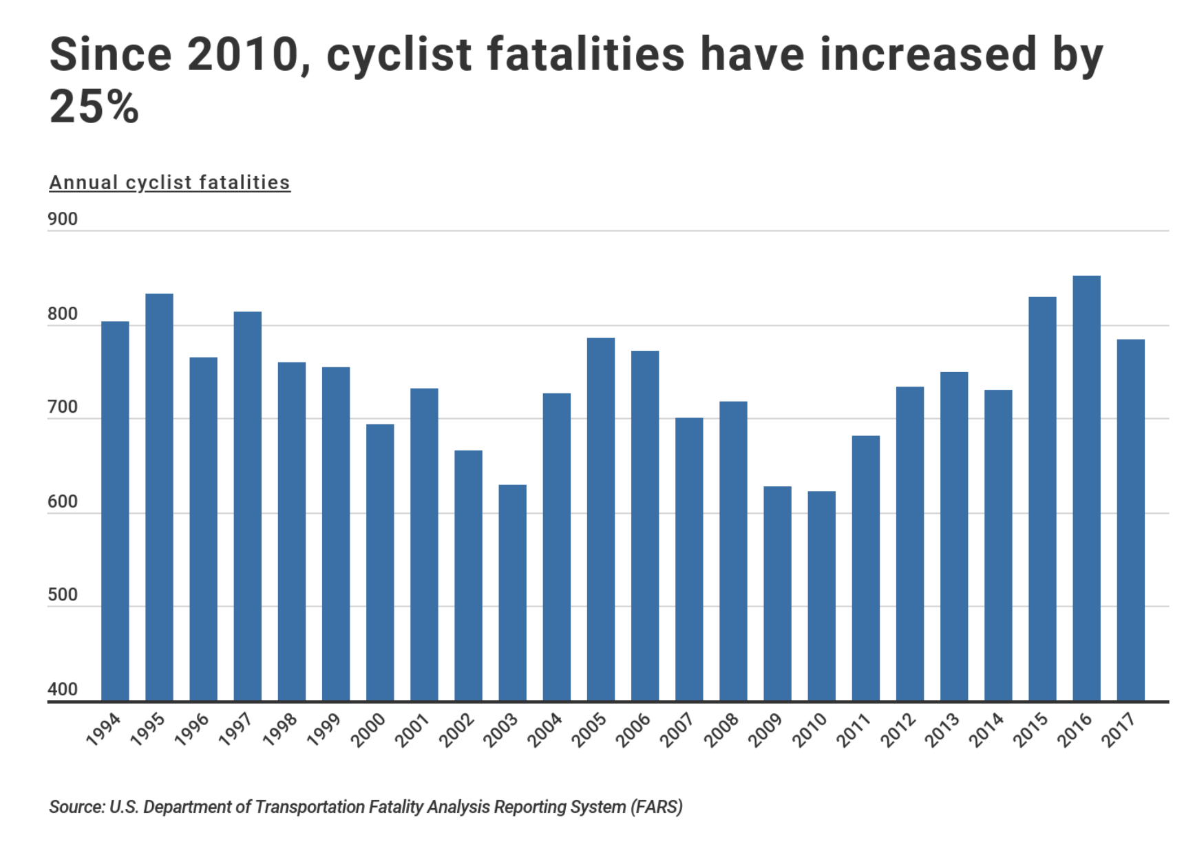
In 1975, the worst year for cycling fatalities, there were 1003 cyclists killed around the country. However, the demographics were completely different. In 1975 the majority of the bicyclists killed were… KIDS! Folks under the age of 18. As as the kids of the 60s and 70s grew into adulthood they kept riding… they are STILL riding. The number of riders killed started to drop. In the 1980s the average number of cyclists killed each year was less than the 70s. The average killed in the 1990s was less than the 1980s and the average number of cyclists killed in the 2000’s was less than in the 1990s.
As I’ve written before, though, this changed around 2009 – the numbers are coming UP again. Ohio, for years, averaged around 16 cyclists killed annually. However, from 2015-2019 Ohio has averaged 21 cyclists killed by motorists… a significant jump. Nationally, while the fatality numbers are still down from 1970s and 1980s, they are UP 38% since 2010.
Meanwhile, motorists are killing each other at slightly LOWER rates. Data from FARS tells us that starting in 2009, the total number of traffic fatalities has been LOWER during the past 10 years than in previous decades, despite increases in the number of cyclists [and pedestrians] killed.
What ELSE came about in the 2008-2009 time frame that could be contributing the crashes killing cyclists and pedestrians but not motorists?
As I’ve said before, to ME the logical/obvious thing to look at is pretty simple – SMART/INTERNET PHONES + FASTER INTERNET SPEEDS + SOCIAL MEDIA = MORE DRIVERS NOT PAYING ATTENTION –
I suspect that just about EVERYBODY thinks they are a “good driver” – certainly “better than average” – as Lake Woebegone Syndrome runs rampant. Everybody thinks they can handle their phone safely while driving. Phones/Internet/Social Media of Today didn’t exist in 2008. Phones were not that fast – they didn’t take great photos or video. In 2008 very few people were posting photos or video to the internet, or “following” people on Instagram or using any of the apps like SnapChat etc as they hadn’t been invented yet. Faster phones with better camera combined with 4G/5G internet speeds and very cool social media apps allowed folks to access EVERYTHING from the “safety & comfort” of their seat behind the wheel of their moving vehicle.
In fact, people looking at their cell phones may even slow down a bit, making them less of a fatal risk to other road users who are encased in 2 tons of steel. However, when it comes to pedestrians and cyclists, a “speed” that KILLS is much lower … A 45 mph car/car crash may not kill anyone in the cars, but a 45 mph car/bike or car/pedestrian crash is likely to be unsurvivable. A motorist who spends 5 seconds reading a text or looking at a cute kitten video travels 330 feet – 110 yards – more than a FOOTBALL FIELD at 45 mph. They are basically driving with a paper bag over their heads- incredibly UNSAFE behavior that is likely to result in the death or maiming of any pedestrian or cyclist in their path.
Each of Ohio’s 23 fatal bike crashes in 2019 was unique – each left a family shattered – each is a tragedy, regardless of fault. We owe it to our cycling community to figure out WHY the numbers are going up… and to do something about it…
One step that is being taken in Ohio is the recent introduction of House Bill 468 which would alter current Ohio law and make texting while driving a PRIMARY offense. This means that if an officer sees you checking out your phone you can be pulled over. Whether this is a good idea or not may be debated in the Ohio legislature if the bill works its way to the floor. Right now, it is in the very first stage- it is introduced. You’ll be hearing more about it as time goes on.
Let’s be careful out there!


